This was a great introduction to the next project and was a great opportunity to develop on our knowledge from a similar activity we were asked to do earlier in the course.
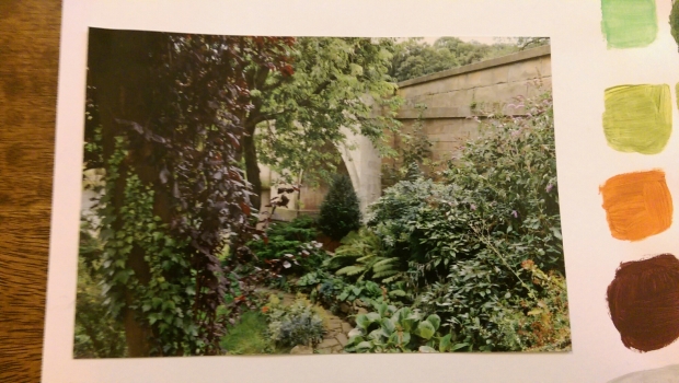
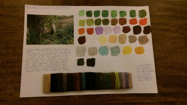
For my first analysis I chose a photo from my visual collection from my photography of a little secret garden.
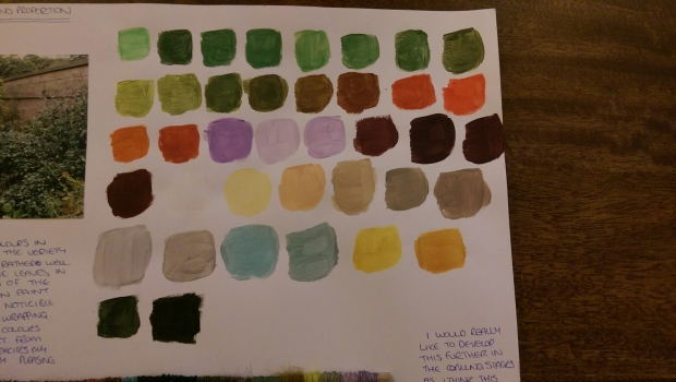
It was only after I had chosen this photo and gotten started that when really looking at the photo and the colours in there, I realised the amount of different colours there actually were which left me feeling a little daunted. I used acrylic paint for this activity as I feel they are the best paints for mixing and colour matching. I tried to get every colour my eye could pick up although I know I probably missed quite a few. It was a great start and I found the focus came quite naturally and even though I may not have gotten all the colours that are in the picture, I feel the colours I did manage to pick our were matched to the best of my ability.
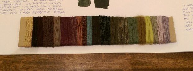
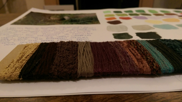
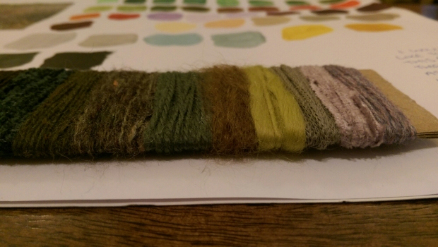
The next step was to try and match colours with yarn and try to match textures and proportion. I think this bit was harder mainly because I was limited to only the yarns I had available in my collection and not everyone matched identically. They matched close enough though. Also when it texturally, I didn’t feel that all my yarns matched but as a whole, they gave a very nice effect.
After i had finished wrapping the yarn I realised I didnt get the proportions right at all. I was so focused on trying to get the colours matched that I hadn’t paid attention to the amounts I had been wrapping.
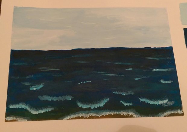
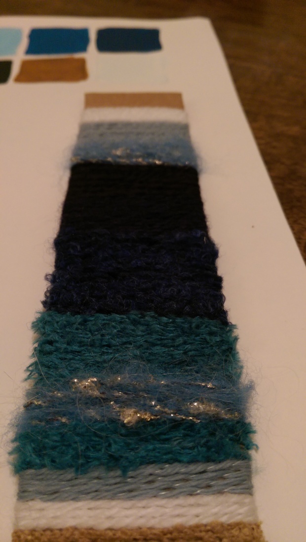
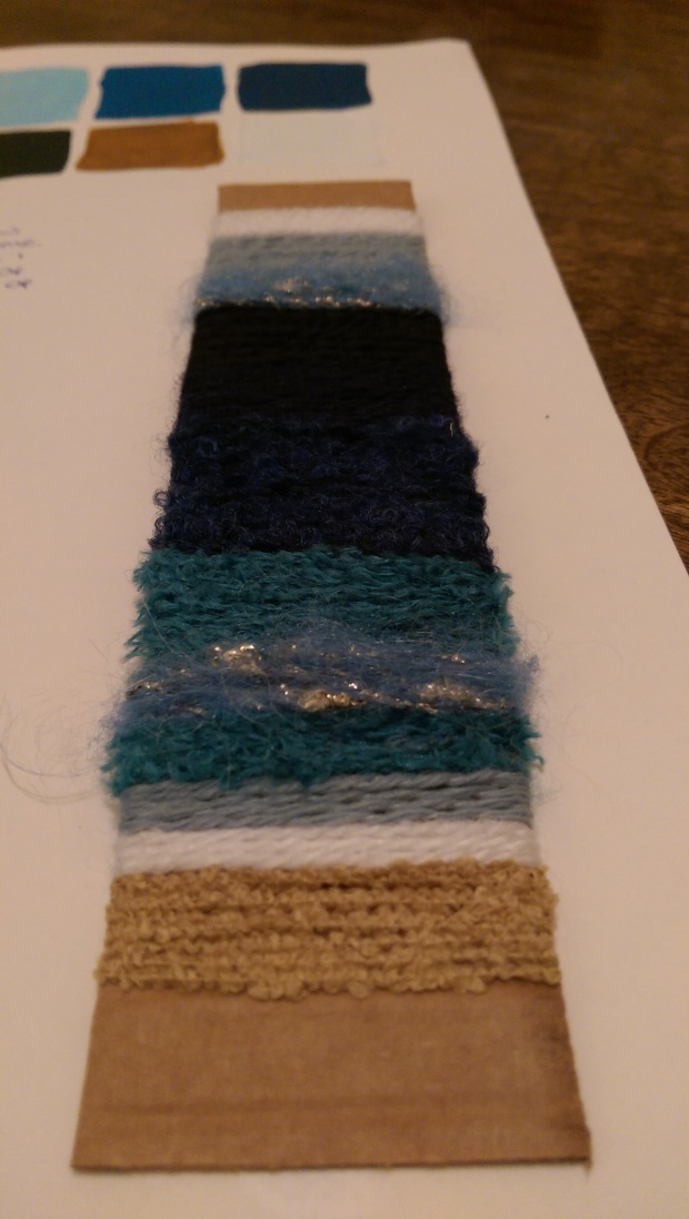
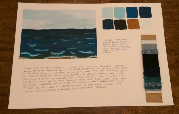
I decided to start on another analysis, this time using one of my own paintings.
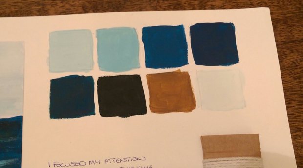
I found the colour match activity for this one alot easier, probably because I had made the original so I remembered the colours I’d used.
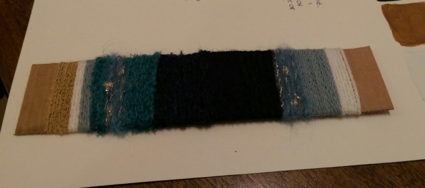
I also really enjoyed the wrapping for this picture. I felt the yarns used matcged really well and because I had focused more on the porportions and ensuring they matched, the wrap made almost a second piece of artwork next to the original.
Again the textures didn’t match exactly but still found the overall effect very nice and I loved how the lines from wrapping the single strands created a sense of waves, the separation in the water as you can see it from shore.
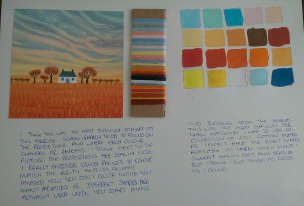
My last experiment was using a card of a house and field from a collection i used earlier in the degree
This was harder to match with thread as there was alot of varying shades rather than different colours and I didn’t have them all but I liked the flownofbthe ones I used as a seperate wrapped sample. I has to use my collection of 100% cotton cross stitching threads as that is where I had alot more varying tones which ment I lost the opportunity to play with texture which was a shame. I am happy with the overall out come though.
I was really pleased with how these turned out and really enjoyed this experimental and development process. I can see me using this process again in the future for things like my theme book and other projects.
